Topological Networks: The Future of Visualizing Data
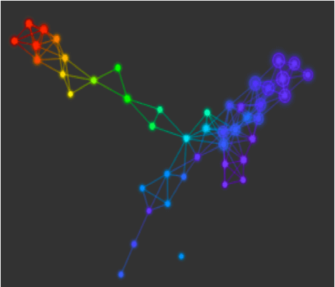
The idea of visualizing data is a very appealing one. It provides a way to leverage our visual capacities to obtain information and understanding more quickly than by examining the data by query or algebraic methods. There are many ways to visualize data sets. Histograms, pie charts, bar graphs, heat maps, scatterplots, etc. are all appealing ways to display and discover data, all of which can bring forward important insights. The fundamental difference between these methods and topological data analysis (TDA) is the way that TDA allows you to interact with and represent structured and unstructured data through a topological network. In general, a topological network provides a map of all the points in the data set, so that nearby points are more similar than distant points, rather than providing a visual representation of the behavior of one or two of the variables defining the data set. Think of how valuable geographic maps are in understanding the geography of a region. The topological network plays the same role for data. Below you will see a topological network representing a well-known early diabetes data set, the Miller-Reaven data set. TDA automatically created this network that neatly describes the data set in three groups, represented by “flares”. These turn out to correspond to well known groups of clinical outcomes – upper right blue flare consists of healthy patients, lower middle blue flare are pre-diabetics, and the red flare in the upper left are overt diabetic patients. The coloring is by glucose level, which indicates that the overt diabetics generally have high blood glucose levels. The construction of the topological network is done automatically, and clarifies the structure of the data set without having to query it, or to perform any algebraic analysis on only a subset of variables. If one works with other kinds of visualizations, one would have to perform a number of by-hand analyses to find this structure. One would have to work with, say, histograms and scatterplots of values for blood glucose and insulin response to eventually find out that there are these three groups. Perhaps more important, though, is that the network does not provide just a visualization, but actually an interactive model for working with the data. One is able to color the network by variables used in the construction of the network, or by metadata. For example, if one had a data set of diabetes patients, one could color the nodes by patients with type I diabetes. In addition, one can select any part of the network (and therefore part of the data set) to perform further study and analyze the fine grain structure within the data. Having interrogated the data in this manner, one can obtain understanding about what characterizes different subgroups, and then find statistically significant features that distinguish each group from the rest of the data set. What this means is that the topological network is very easy to interrogate, allowing one to discover the true meaning of the data by analyzing a compressed representation of the data set retaining all of the subtle features. In this representation, each node corresponds to multiple data points, and so the number of nodes is often much smaller than the number of data points. Each node contains data points that have a degree of similarity to each other. So the network gives much more than a static visualization. Instead, it provides a workbench for searching and analyzing data without having to perform algebraic manipulations or database queries. It gives one a way to understand the overall organization of the data directly. The idea of visualizing data is a very appealing one. It provides a way to leverage our visual capacities to obtain information and understanding more quickly than by examining the data by query or algebraic methods. There are many ways to visualize data sets. Histograms, pie charts, bar graphs, heat maps, scatterplots, etc. are all appealing ways to display and discover data, all of which can bring forward important insights. The fundamental difference between these methods and topological data analysis (TDA) is the way that TDA allows you to interact with and represent structured and unstructured data through a topological network. In general, a topological network provides a map of all the points in the data set, so that nearby points are more similar than distant points, rather than providing a visual representation of the behavior of one or two of the variables defining the data set. Think of how valuable geographic maps are in understanding the geography of a region. The topological network plays the same role for data. Below you will see a topological network representing a well-known early diabetes data set, the Miller-Reaven data set. TDA automatically created this network that neatly describes the data set in three groups, represented by “flares”. These turn out to correspond to well known groups of clinical outcomes – upper right blue flare consists of healthy patients, lower middle blue flare are pre-diabetics, and the red flare in the upper left are overt diabetic patients. The coloring is by glucose level, which indicates that the overt diabetics generally have high blood glucose levels. The construction of the topological network is done automatically, and clarifies the structure of the data set without having to query it, or to perform any algebraic analysis on only a subset of variables. If one works with other kinds of visualizations, one would have to perform a number of by-hand analyses to find this structure. One would have to work with, say, histograms and scatterplots of values for blood glucose and insulin response to eventually find out that there are these three groups. Perhaps more important, though, is that the network does not provide just a visualization, but actually an interactive model for working with the data. One is able to color the network by variables used in the construction of the network, or by metadata. For example, if one had a data set of diabetes patients, one could color the nodes by patients with type I diabetes. In addition, one can select any part of the network (and therefore part of the data set) to perform further study and analyze the fine grain structure within the data. Having interrogated the data in this manner, one can obtain understanding about what characterizes different subgroups, and then find statistically significant features that distinguish each group from the rest of the data set. What this means is that the topological network is very easy to interrogate, allowing one to discover the true meaning of the data by analyzing a compressed representation of the data set retaining all of the subtle features. In this representation, each node corresponds to multiple data points, and so the number of nodes is often much smaller than the number of data points. Each node contains data points that have a degree of similarity to each other. So the network gives much more than a static visualization. Instead, it provides a workbench for searching and analyzing data without having to perform algebraic manipulations or database queries. It gives one a way to understand the overall organization of the data directly.